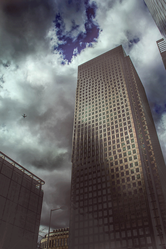
A2 Photography Exam Growth and Evolution
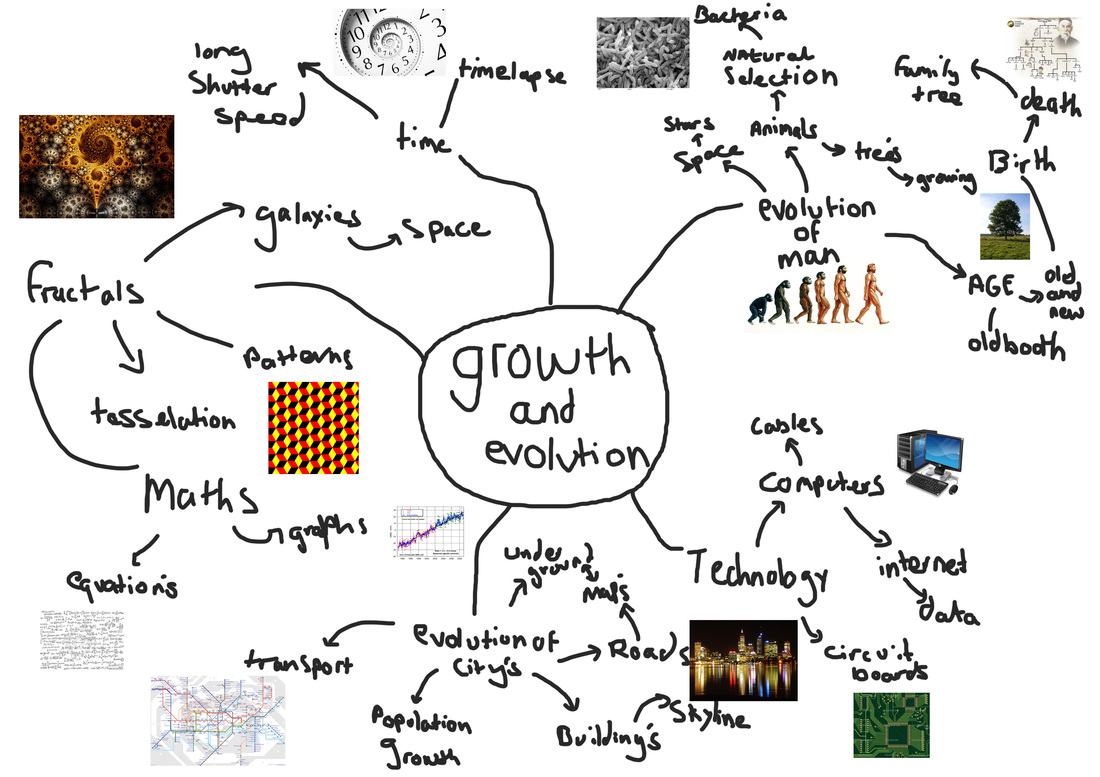
Brain Storm
For this task I was assigned to create a mind map to give me ideas for what to do in the exam. I was given a few ideas shown below. I liked the idea of Motorways, Electrical components and wiring. This gave me a few ideas with long shutter speed to capture the lights from cars and compare them to wiring for a house. As they both have a very uniform look. Below is a picture of my Brain storm for the unit 4 exam on Growth and Evolution.
- Bacteria, algae, roots, shoots,branches, cells,
- History, politics, war, religion
- Volcanoes, coral reefs, wrecks, erosion, rivers
- Circuit boards, wiring, electrical components, the internet
- Media, communications, transport, networks, cities
- Urban development, factories, nuclear power stations, wind generators, turbines,
motorways, industry - Tessellation, fractals, diversity, chaos, galaxies
- Eco-friendly vehicles, recycling, rebuilding
- Wisdom, maturity, old age, relationships, birth, spring.
Evolution of Time
|
|
|
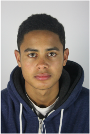
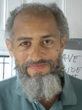
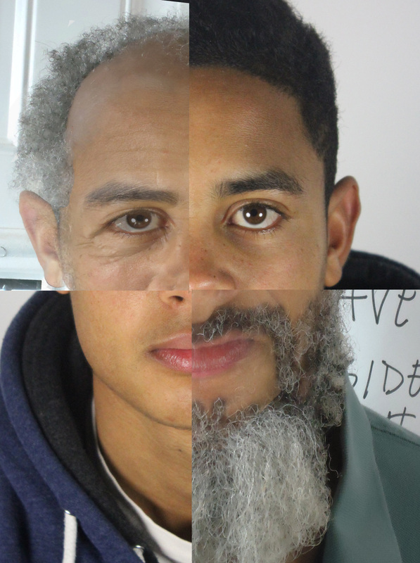
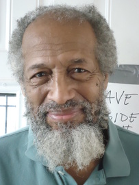
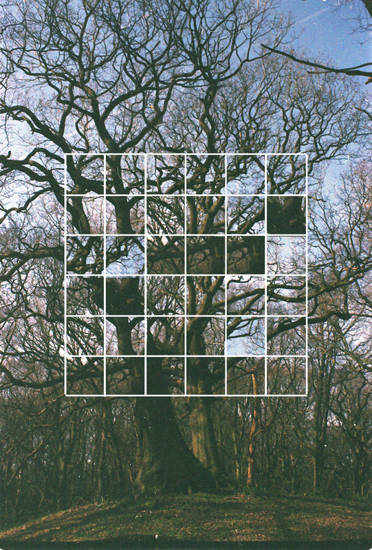
These photos show the how age effects the appearance of a person. The first image in the center of the page shows a combination for the two images to the left and right of it. This effect was achieved using the opacity tool, and rubbing out certain parts of the faces. I like this effect as it gives the subject a chance to look into the future to see what they may look like when they are older. The Images below shows another combination of the right and left images. I wanted to create a piece of work that reassembled time as a clock. So I cut the image into quartos like in a clock with 15 minutes, 30 minutes, 45 minutes and the hour. This idea could be improved by having different ages going around the clock. So you have a baby at 0 to15 minutes and then teenager at 15 to 30. After you would have adult from 30 to 45 minutes and finally from 45 minutes to the hour the subject at old age. I think this would look really interesting and would be a good respiration of someones life. This could also symbolize reincarnation as the clock goes round and round never ending, like life.
Humans evolved
Surreal (Photoshop)
These are a set of photos that I have edited on photoshop I decided to create a bird man, as it is related to the story of Icarus with the wings. I found a picture on google of a bird flying across a city landscape. I then took a photo of my subject in the studio, I then cut him out and pasted him into the bird image. I then cut out the section of the bird that I wanted to be replaced by my subject. I then added some colour correction to match the landscape and added some blur to make it look like my subject is flying.
The next image is of my subject flying in a paper aeroplane across a landscape. I used the same process of the last image. I found it quite hard to get the subject to fit the scene.
The final image was of a plane going through the sound barrier creating a sonic boom. I then removed it from the image by using content aware and then placed my subject within the frame. After I had done this I needed to get the subject to look like he was moving through the cloud. This was quite hard I had to mess around with the blur tool and the opacity of the subject's legs.
I think these images have come out quite well as it puts a subject into flight without the help of technology. It gives the subject what man has dreamed of for eternity, flight. I think these images show how evolution could have moved giving humans flight.
Natsumi Hayashi
These are 3 photos taken by Natsumi Hayashi, she takes pictures of herself in mid air to give the effect of flying. She puts herself in interesting positions and locations. I like the photo with the water fountain as it enforces the effect as it looks like she is about to take a drink while flying in the air. I like the colour as it is bright and looks like a view from ones eyes. This makes the photo seem even more real, I also like the framing as it gives a lot of negative space to the surroundings which has a lot of blur and then the subject is really crisp. This draws your eyes to the subject and the action of her flight. The next photo in the set of three shows her levitating in a hall way. I really like the light in this photo and the reflection on the ground, she looks like she is really natural in the pose and this makes the idea that she is able to levitate, stronger.
Sam Taylor Wood
These photos by Sam Taylor Wood are fantastic he really captures the moment, the first photo looks like she can balance on the chair as the photo is one section of the movement of the action of climbing on the chair and falling off. I like the framing of this as it puts her to the left of the image which complies with the rule of thirds. I like the use of the shadow in the background as it looks like she can fly with out the use of the chair. The next image shows a woman trying to use balloons to help her fly this reminds me of the film UP as the old man uses balloons to get his house to fly. I like his photo as it seems that the balloons really do give her lift. The photo also has a black background and a vignetting foreground this make the subject stand out. I like the different colour balloons and the small number of them as it make the photo seem more unrealistic as we all know that 4 balloons cannot support the weight of a woman. I like these photos and would like to create a response to them with the environment of my school. I would like to use the technique of Natsumi Hayashi but the style of Sam Taylor Wood and I like the way he has framed his photos and given them the unrealistic look.
Levitation response 1
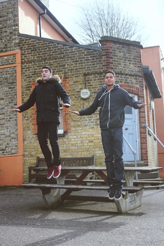
This is a photo I have taken that shows two subjects that appear to be levitating I looked at two artists above that gave me inspiration to create this piece I like how Natsumi Hayashi made herself look comfortable in the air and make it look easy and natural, It was quite hard to pull off this effect and I had to ask my subject to jump several times to achieve the shot that I wanted. I used a fast shutter speed to capture them in mid air. The subjects had to jump and pull a pose. I then used a continuous shutter to capture the hole action this increased my chance of capturing them in mid air. I think the photo has come out quite well but I would like to use this technique in an actual scenario to create a story behind the levitation.
Levitation Response 2
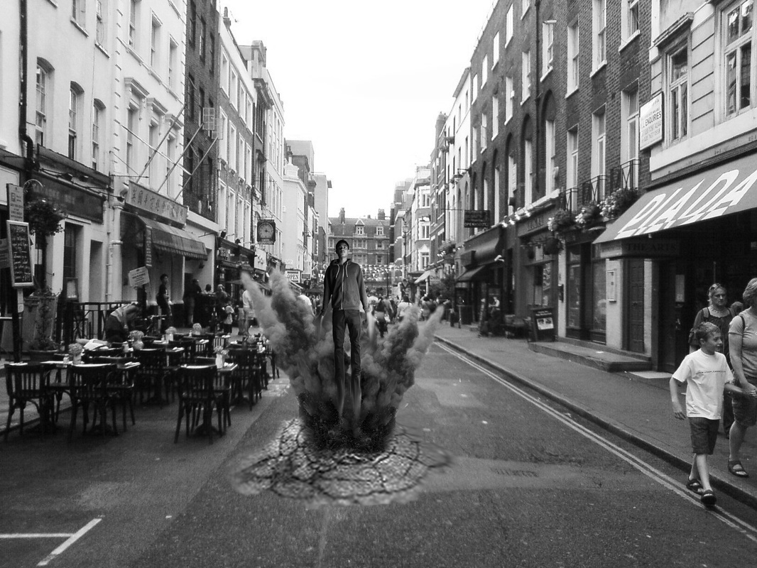
This is my second response, After watching the new superman movie I decided to re-create a scene from the film. I asked my subject to jump and pose in a flying position. I then Googled some photos for cracks in the street and then a location for the scene. I then photoshoped in the crack and the smoke and explosion. After doing this I then placed the subject within the photo. I added some blur and smudge to create movement within the photo. I think it came out quite well If I was to do it again I think I would adjust the levels of the subject as it does not completely match the scene. I like the idea of turning ordinary people into super hero's with powers etc.
Super Human Photography
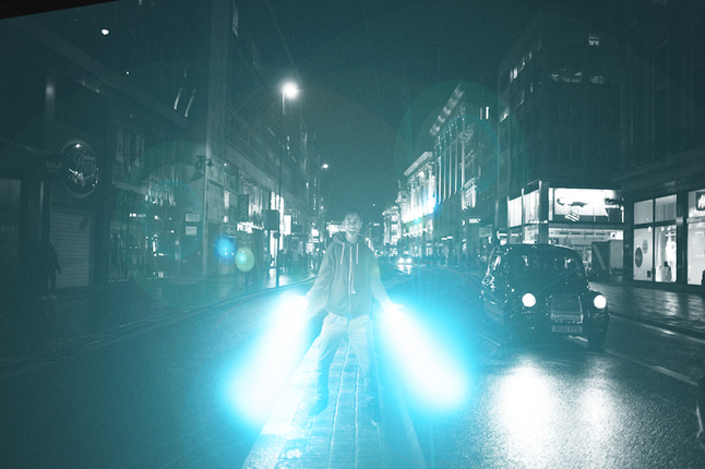
I then decided to create some work using photoshop, I idea was to create a superhuman with super powers, I used the photos to the left as inspiration for my work. I found these photos on tumblr. I thought they looked really interesting as they could use photoshop to drastically change the image and make the subject look super human. I then used photoshop to edit some photos I took of my class mate, I used light flairs to create the look of him having super powers. I took the photo in the studio so I could easily cut him out and place him into a background of my choice. This then allowed me to create the piece above. I think it could be improved by having the light a little weaker and not as bright.
|
|
|
TimeLapse
THE GAME HAS CHANGED from Michael Shainblum on Vimeo.
I found this timelapse on vimeo and it gave me the idea of trying it out myself, I liked the idea of making a time-lapse as it shows the evolution of time.
This is the first time-lapse that I have made, I decided to make one as it shows time in a way that we don't experience normally. I got the inspiration from several time lapses that I found on Vimeo. I really liked how they looked and the way that they showed the evolution of time. The video above is my first timelaspe, I think that it has come out quite well however I think it could of been improved by having the window out of the frame. I really like how the video shows the change of time from mid-day to sunset to night.
This is the second timelaspe that I have made, I used a GoPro instead of using my DSLR as I thought it would be a good idea to experiment with using different types of cameras. In this timelaspe I used different setting, I made the camera take a picture every 2 seconds instead of the last timelapse which was every 10 seconds. This means this timelapse it a lot smoother and does not show time moving as fast. For my next timelapse i would like to choose a setting in the middle maybe something like 7 to 8 seconds. I think this timelapse was successful as it has a lot of movement within the frame, as the sky is very clear and shows lots of clouds moving. However I would like to make a timelapse in an environment that has a lot more going on. Such as taking several timelapses in central london where there is a lot of motion.
This is another TimeLapse that I have made, I decied to go to central london with my camera and take several timelapses around the city. I used google Picsia to create the timelapse, I made the video move through 25 pictures per second. I did this because I wanted the motion to appear a lot faster than normal time. I then edited the video on Adobe Premier pro where I adjusted the colour curves and then added music. I like the music as I think it goes well with the video and the video and music have been synced. I think the last part of the timelapse is the best as it has smooth motion with the camera turning around on a clock timer. I really like it as it shows smooth motion within the frame and fast motion within the pictures.
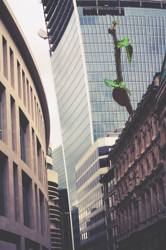
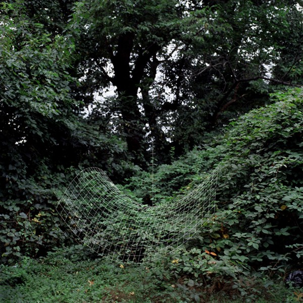
Man VS Nature
These photos show the battle between nature and man. It shows nature taking back and over growing the man made objects. I like the way these photos are framed as it shows the plant over powering the metal and the fences. I like the ways these photos have been edited as the colour correction really brings out the leaves and the detail.
Nature inside
These are a few photos that I have edited to create the look of nature being in places that It usually doesn't appear. I think these photos show how nature will one day over power and take back the city's and concrete world that we have created. This is shown by the short time that nature has been taking back Chernobyl as we are not able to go there and remove the weeds and cut back the trees. I would like to take some photos of abandoned buildings that have natural nature inside, I think these would create some very interesting photos as they show that we don't control everything and we are only here for a short period of time.
Evolution of the Camera
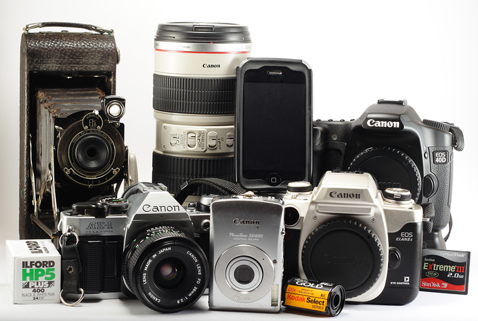
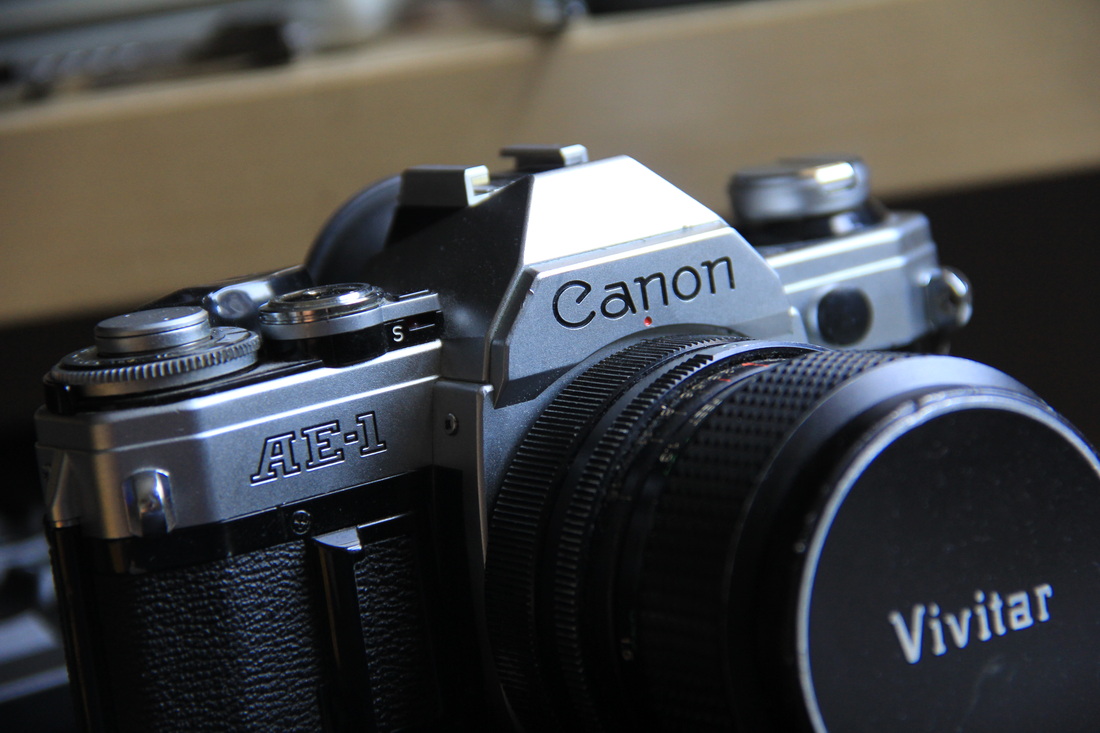
This task was to take the same photo on 3 different types of camera's. We used a Pinhole, 35mm Film Camera and a Digital camera. With this task we had to use the dark room and different techniques to take the photo. With the pinhole we had to load each frame in the darkroom and had to guess the exposure, once we had taken the photo we had a negative. We then printed it in the darkroom to get the positive image. With the film we just had to load a roll of film and then develop it and create prints in the dark room. The digital camera is the easiest as you simply click the shutter and the image is loaded onto the SD card in a digital format and then you can edit it in photoshop.
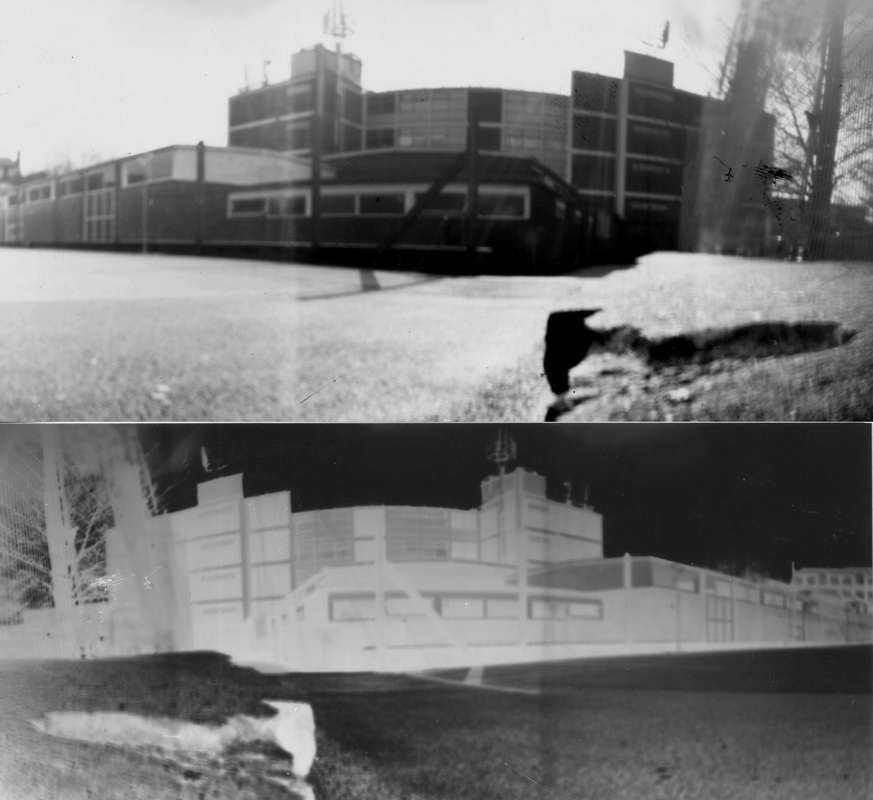
Pinhole camera
These are the positive and negative taken on the pinhole camera. I like how it has come out as it looks like a wide-angle lens this effect was made from the photo paper being curved in the Pringle can. This gives the audience a wide view of the location and subject. I do like this process but I don't see myself carrying it out on the exam task as it takes too long and there are better processes for this effect such as expired film.
These are the positive and negative taken on the pinhole camera. I like how it has come out as it looks like a wide-angle lens this effect was made from the photo paper being curved in the Pringle can. This gives the audience a wide view of the location and subject. I do like this process but I don't see myself carrying it out on the exam task as it takes too long and there are better processes for this effect such as expired film.
Film
I do like taking pictures with film as you have to wait and see what you get, however once you insert a film of lets say 200, you can just change the ISO of the film when it suits you. You have to use the hole roll.
I do like taking pictures with film as you have to wait and see what you get, however once you insert a film of lets say 200, you can just change the ISO of the film when it suits you. You have to use the hole roll.
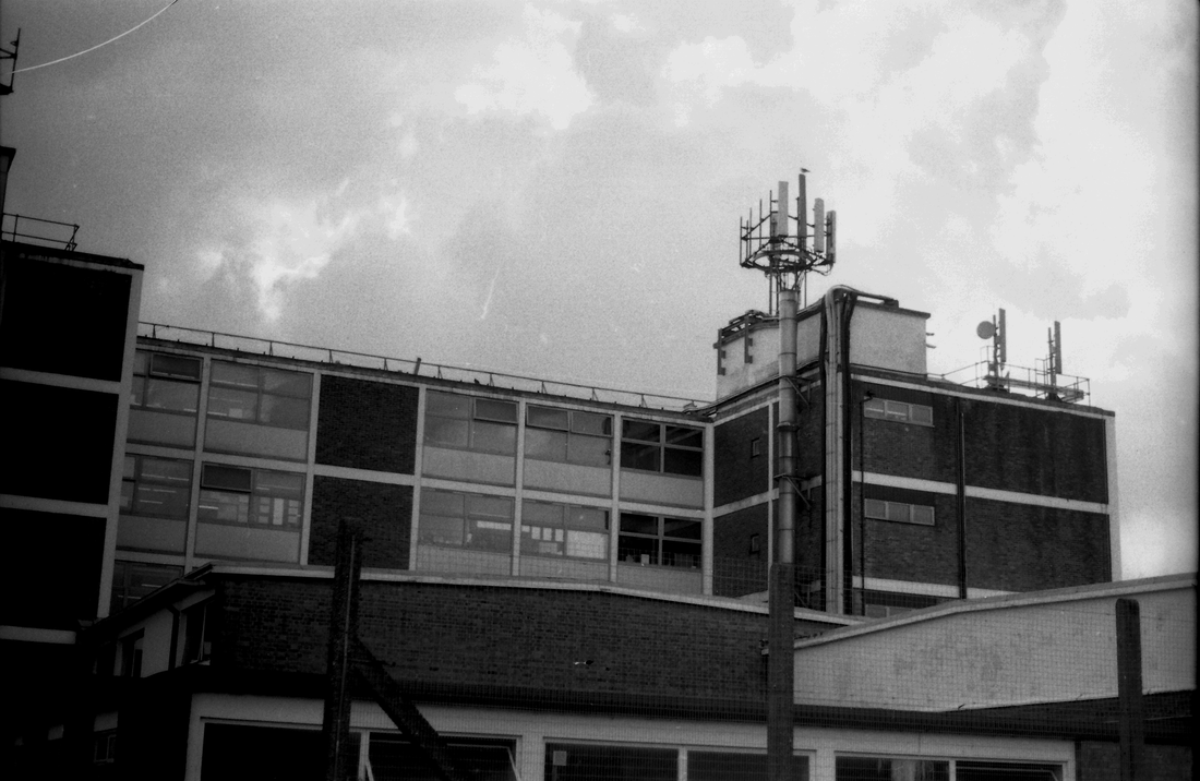
Digital Camera
These are the photos taken on the digital camera it has taken a much better image as it has all the tones and detail, unlike the pinhole camera. It is also a lot easier to get the correct exposure as you can look at the photos you have taken as soon as you take them unlike the other two processes. With this process of capturing an image you have a lot more freedom with the image.
These are the photos taken on the digital camera it has taken a much better image as it has all the tones and detail, unlike the pinhole camera. It is also a lot easier to get the correct exposure as you can look at the photos you have taken as soon as you take them unlike the other two processes. With this process of capturing an image you have a lot more freedom with the image.
Cutting edges by Jelle Martens
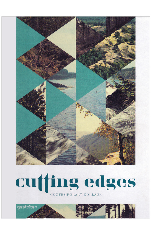
I came across this image on Art2day under the tab Growth and Evolution, I really liked the colour and style of this photo and would like to try making a simpler image. I would like to try this with 35 mm film and then scan it in and create the collage with photoshop. I like how the artist has used the same shape to cut out of each image. I also like how the images and section stick together and create the whole image.
Response
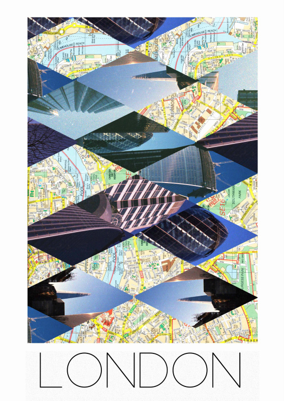
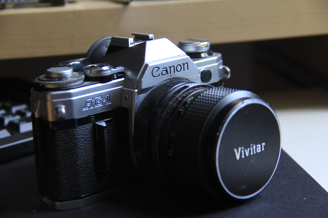
This is my response to cutting edges by Jelle Martens, I found an old London map which I scanned into the computer. I then purchased old expired film off the internet which expired around the same time as the map was made. I then traveled around London taking photos of iconic scenes and buildings. After the film was processed I scanned it in and cut out diamond shapes. I then did the same for the map. This created a pattern and allowed me to put together the map and the film pictures. I really like what I have created as it shows the old London map with the new London sky line through the eyes of expired film. Therefore there is a clash between old and new within the piece. I think this could be improved by having more pictures and maybe combining the old map differently with the pictures. I like the graphical look to these types of photos and photo collages, as I find it interesting how all the shapes fit together and create one large photo. I also like the text at the bottom of the photo as it has very basic shapes and reminds me of a skyline. as all the lines are bold and stand alone.
These are the photos that I used to create the photo collage, they where taken on the film camera shown below. I also used an expired film as this created a contrast between the new skyscrapers and the camera and the expired film. I thought these photos came out very well, I was surprised as the film was expired. I really liked the tonal range and the colour that was produced by the film. Some of the frame came out with a strange purple tint. I was able to photoshop some of these to bring them back to a more natural tone. I though these where good photos to create a photo collage of London as they show some icons landmarks that would look good when placed together.
|
|
Response 2
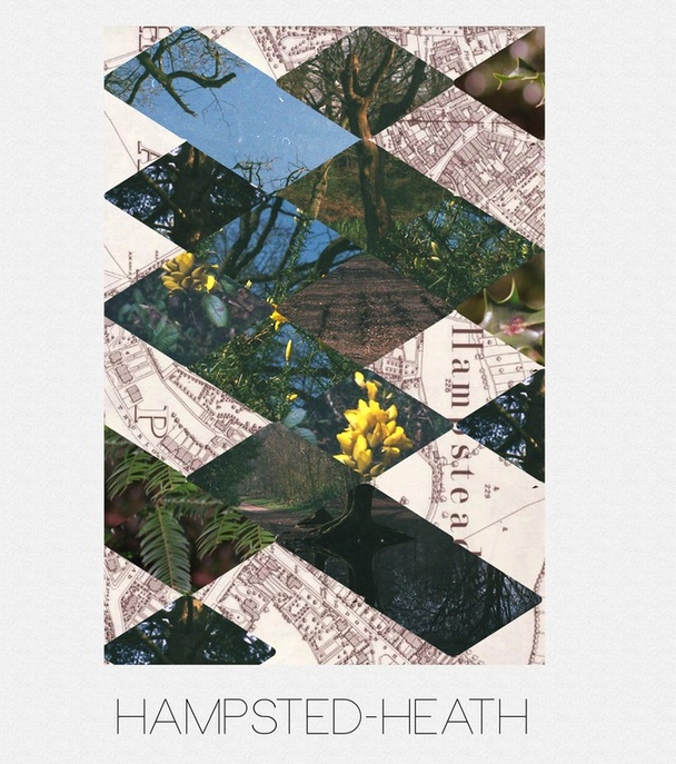
This is another cutting edges response, I used some photos that I had taken at Hampsted Heath using the same film and camera as the first response. I then found an old map of Hampsted and the proceeded to scan it into the computer and then cut out shapes from the photos and place them into the frame creating a small photo collage that shows different parts of Hampsted. I decided to focus on the nature as lots of plants where starting to blossom. I like this piece of work as it the sections all match up and create a puzzle that when looked at together create an understanding of the what Hampsted is like.
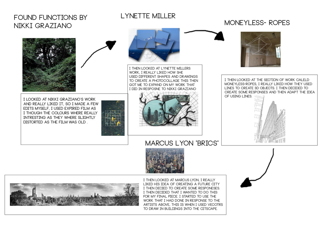
Found Functions by Nikki Graziano
This is a photo by Nikki Graziano from a project called "Found Functions" I really like this photo as it creates a very dramatic photo from a very basic photo and a very basic graph, However when they are placed together in a way that makes them fit together it creates a powerful piece of work. It shows how mathematics is part of everything such as nature. Many people don't realize this, I found a video on Vimeo that relates to this topic and theme. I would like to create pieces of art like this as it is not only about the photo but you have to be able to create graphs and have an understanding of mathematics. Below is the video.
BEAUTY OF MATHEMATICS from PARACHUTES on Vimeo.
I really like this video as it shows the how the real world is all about maths, I think this is a divine idea as it is not only visually interesting but informative to the audience. I would like to try and create some images like the one above, where the graph is placed on top of the image that is associated with. But I would also like to create a piece of work where the graph and mathematical equations are next to the subject so you can see the relation between them and how a basic natural occurrence is formed and can be explained by mathematics.
Response 1
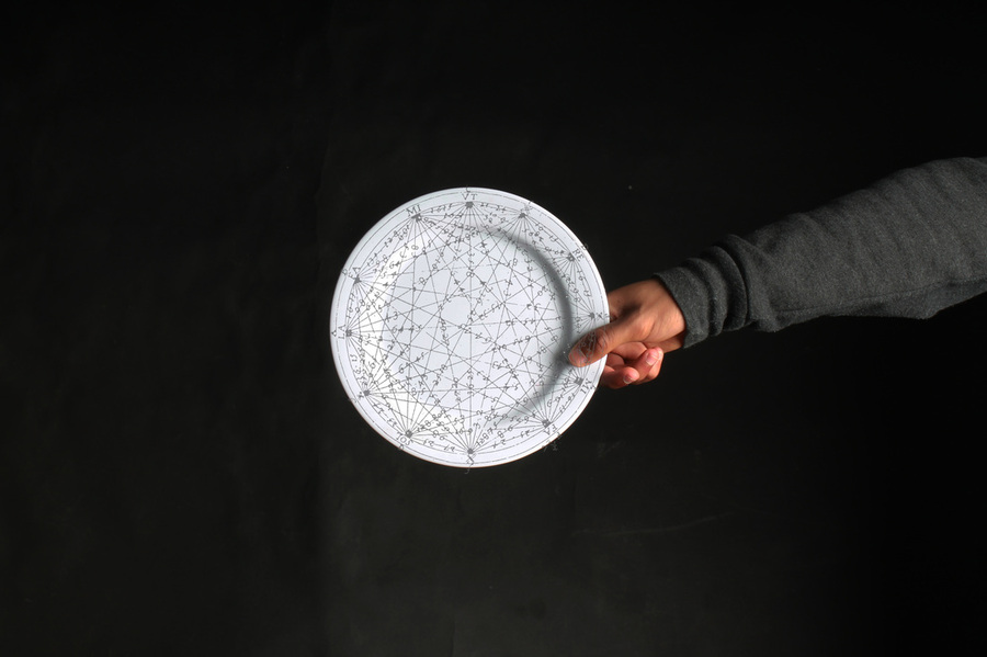
This is my response to Nikki Graiano. I googled a circular mathematical sequence and then cut out all the colour and then pasted it onto a photo I took of a round object in the studio. I would like to do more of this graph work with nature and maybe buildings. I think it looks really interesting as you can see how maths relates to the real work and how the graphs follow the natural and man made curves and strait lines. I would like to carry on this technique with photos taken in a natural environment to show how mathematics is all around us.
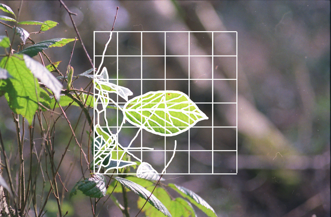
Forest Functions
These are the first edits from the section on forest functions, I think they have come out well as the photos are visually appealing and the colours from the film is very strange as the film is expired and therefore creates an interesting colour scheme, with a range of colours and tones. However on the film a few photos did not develop correctly and have come out with a strong tint of purple. This is kind of solvable with a bit of playing around in photoshop with colour curves. In these photo the graph does not stand out that well this is because I created the lines with the paint brush and then reduced the opacity as I thought it would not stand out as much. However I think it may look better if the audience could see the whole drawing. Therefore in the next set of photo's I'm going to create a more prominent curves and lines.
Forest Function's 2
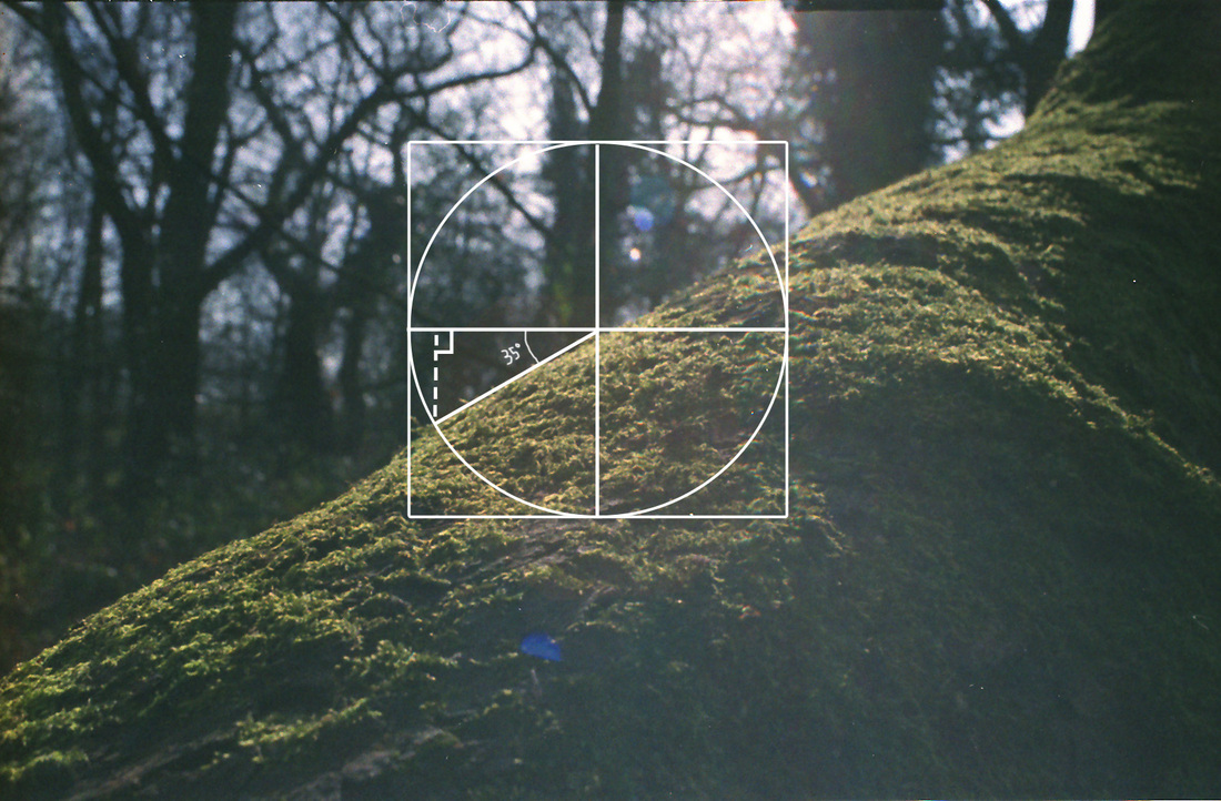
This is the second edit I have done for the pictures that I have been drawing graphs onto. I believe this one looks a lot better as you can see the graph more clearly. I think it has come out quite well and I would like to make more of them, for the next edit I may want to turn the photo black and white where the graph is drawn, this would stand out and create an interesting look as the colour and the black and white would be contrasting and bringing out the graph with out removing/replacing part of the photo. I liked using actual mathematics' instead of just drawing on top of the picture, I would like to see how I can use actual mathematical graphs and equations that fit into the picture.
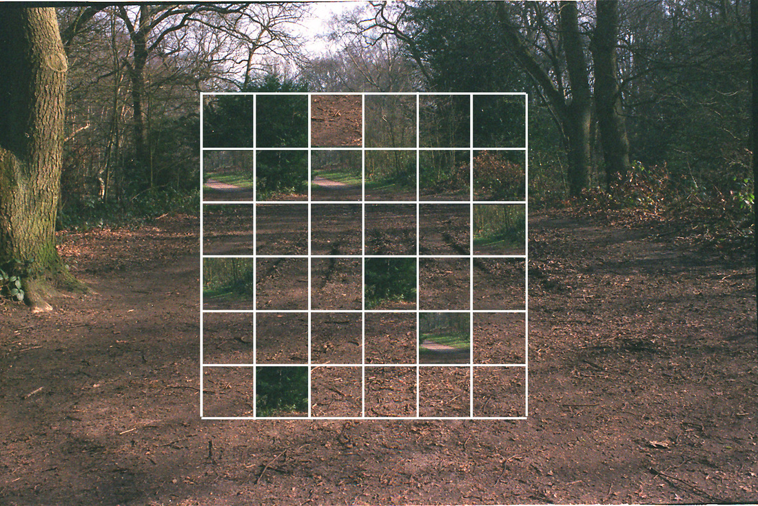
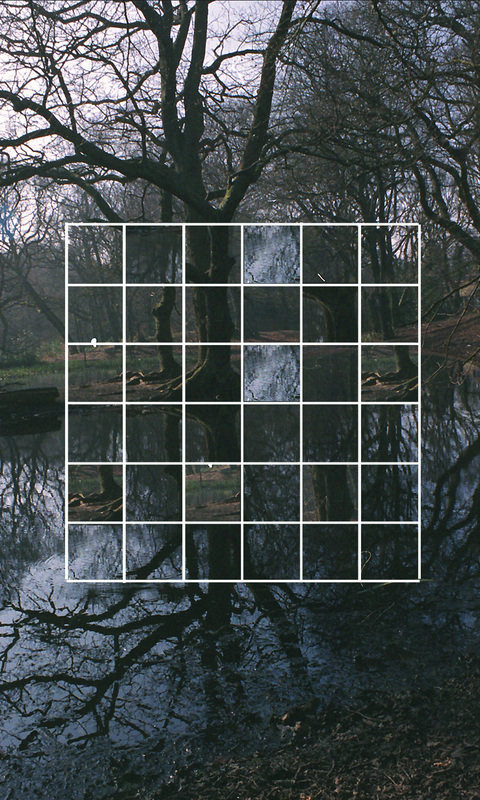
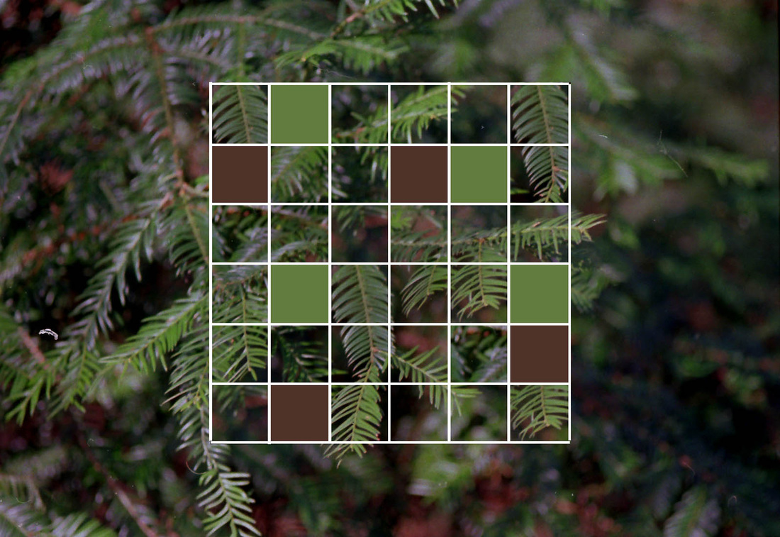
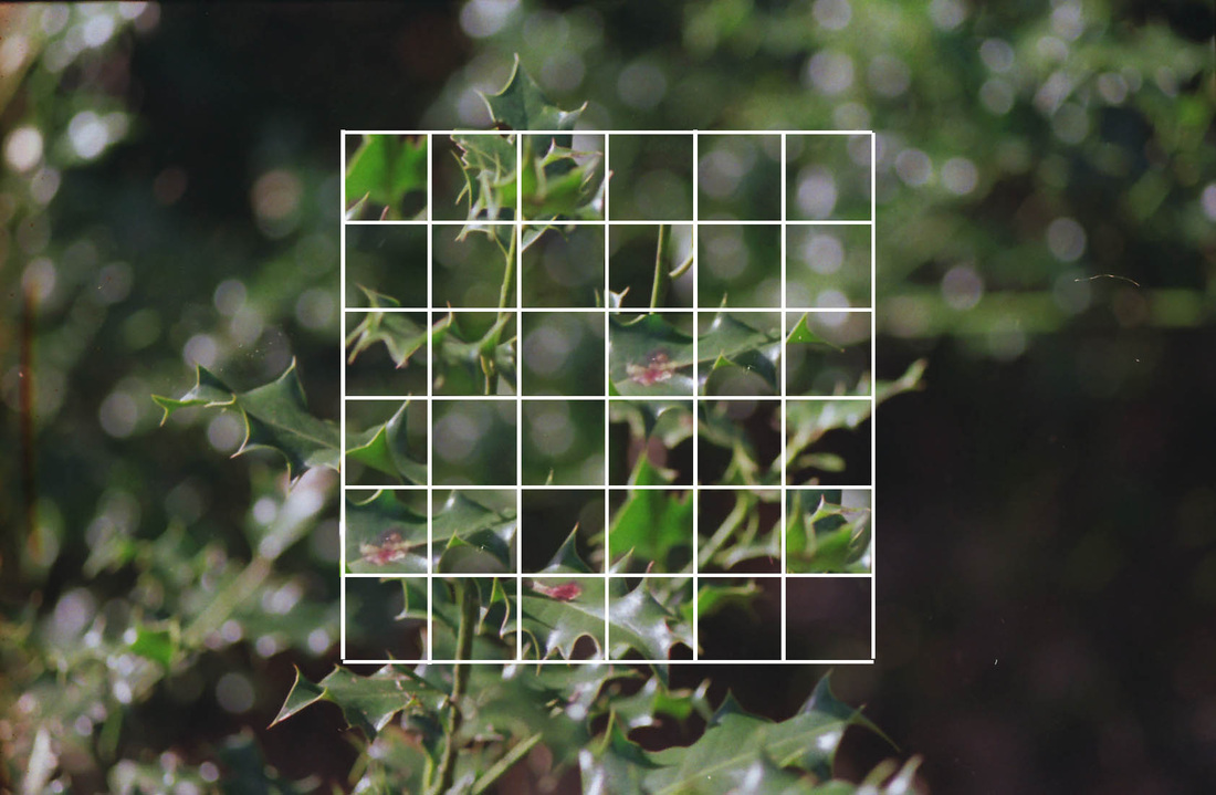
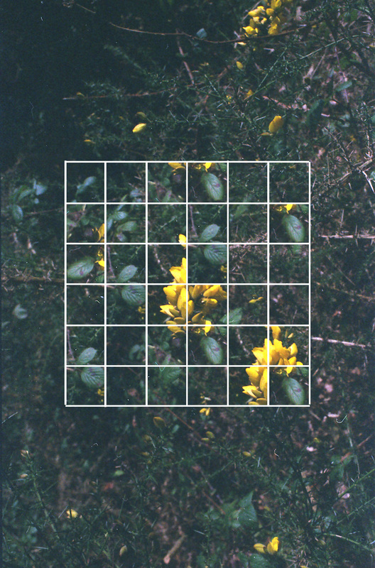
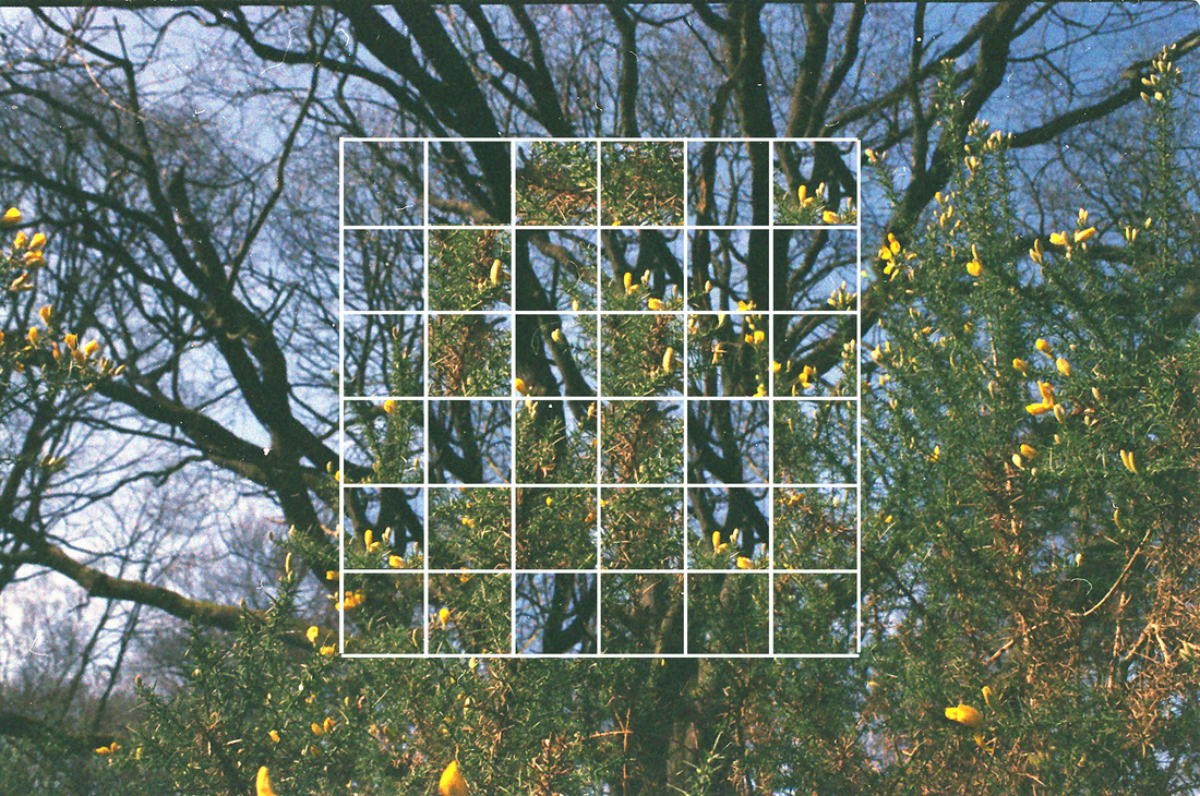
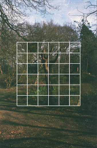
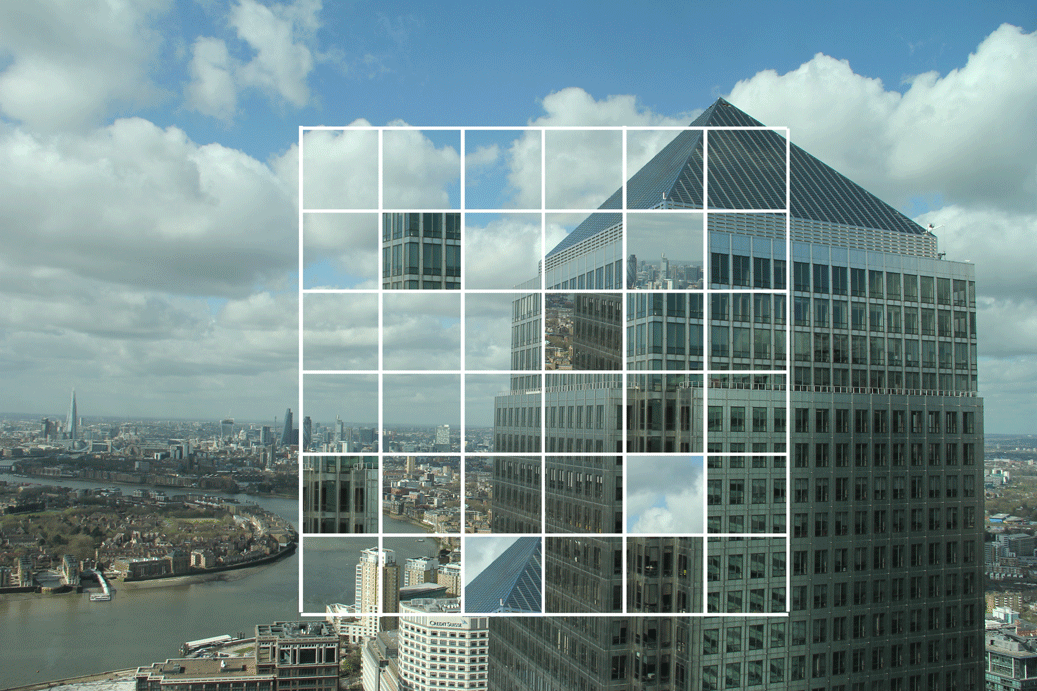
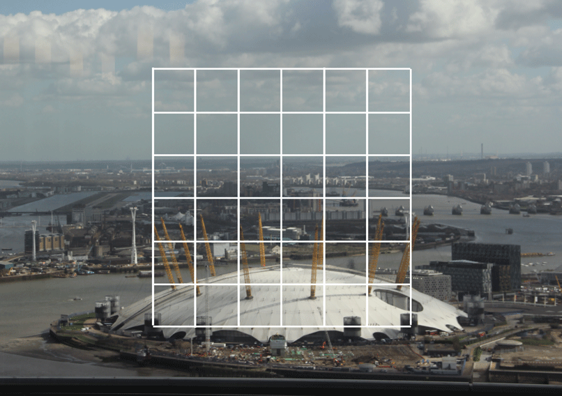
Puzzle's
I then decided to mix up the square in the grid that I had created in Photoshop for the other pieces of work above. I liked this idea as the image in the center was clashing and mixing up with the actual image outside the grid. From the first piece that I made below I created a few more using the same idea. I liked how the different colours and tones matched up and how the eye had to try and un-mix the block to see the actual image hidden behind the puzzle. I also liked how they all used the same square this made it feel like a collection of photos rather than single photographs on there own. Having the square made them all link together.
Following this piece I would like to take it into the city environment, I think this could be an interesting subject as the buildings being mixed up would look more prominent as each sky scrapper has a different pattern and they can be easily distinguished between one an other. I would also like to try and take the photos out of the 2D space and create a rubrics cube with the photos this would create a connection with the audience and the art.
Following this piece I would like to take it into the city environment, I think this could be an interesting subject as the buildings being mixed up would look more prominent as each sky scrapper has a different pattern and they can be easily distinguished between one an other. I would also like to try and take the photos out of the 2D space and create a rubrics cube with the photos this would create a connection with the audience and the art.
|
|
Lynette Miller
|
These are photos created by Lynette Miller who has created a mixture of photographs and mathematical drawings. The base layer is a simple square box piece of paper which she has then placed different shapes which are cut out of one photo. Then she has overlaid on top of this the drawings of circles and angles. These have a slightly lower opacity so you can still see the photo. I really like these as they are simple and its an interesting effect as the user has to build up the whole image from the few sections that the audience has. I also like how the whole photo is not taken up by the actual photo and there is a lot of negative space around the image. I would like to create some of these with photos that I have taken on top of the Citi Building in Central London. I think the photos that I have taken up there would create a good photo-collage in this style.
|
|
Lynette Miller Response
After looking at Lynette Milers work I decided to create a similar piece of work myself I did this by scanning in some graph paper into photoshop, this then allowed me to place cutout shapes from an image that I had taken on a photo shoot in Central London. After placing in the shapes I added some blending options, I added a drop shadow to make the shapes appear 3D and then a Stroke so you could see where the shapes overlap each other. I then used a graphics tablet to allow me to draw on top of the images. I did this in a way that linked all the images together. It reminds me of the stages of designing and creating a building. The drawing in this image symbolizes the stages of architecture and the birth of the building. Then the actual image of the building shows the completed product.
Experimenting
Looking at Lynette Millers work made me experiment with different shapes, I really liked the outcomes as I was able to use black and white for certain sections and colour for others, I really liked the outcomes as they showed a distorted image.
MONEYLESS- ropes
|
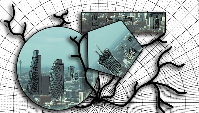
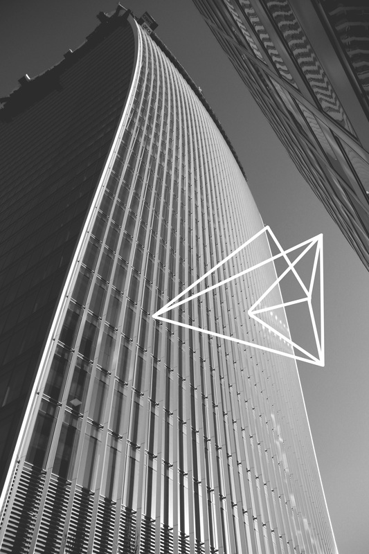
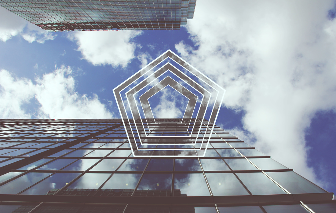
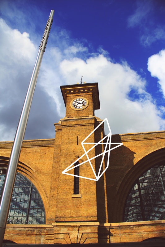
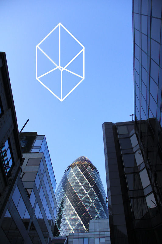
This is another artist that uses photoshop to draw strange 3D objects floating in the air. I would like to create some of these as they are similar to the style of work that I have recently been creating. I like the contrast between the plain shape and the complex environment that the photo has been taken in. I like how you are able to follow the string around and see how the shape fits together. I would like to create some work like this with the background image being in an abandoned building. This would be a good background as it creates contrast between the simplistic and modern shape with has straight edges and the rugged background of the abandoned building which has many shapes and peeling paint.
|
|
The image below is a response I have created on photoshop for Moneyless project on Ropes. I like how it put's a very modern sculpture made of rope into an environment that doesn't suit it. I like the plain colour of the rope and how the shape is not whole and you can see though it. I think this project really shows how complex the world we live in is. This is because the simple shapes made of several pieces of rope is very simple compared to a tree or a flower which has many many edges and shapes. Therefore I see this image as a contrast between human creation and the basic more complex and powerful nature. From this Image I decided to create an image which compared the drawing of a random shape to a human built city. I like the colours and the contrast between the sharp shapes edges and the bright blue. I also like the angle of which the photo is taken as I like how the buildings rise up into the sky and then the edges of the top just appear to vanish. I also like the straight edges of the shape and the buildings around it. I would like to create more of these, I like comparing them to nature would be a more interesting subject as I see a greater connection between the simplicity of the shape and the complexity of nature.
I like this photograph as the edges of the building look sharp and creates a very dramatic perspective for the audience. I also like how the sky is only shown in sections and other parts are blocked off by the building. The colour correction on this photo is also very dramatic as the photograph has a light blue tint that goes well with the straight lines from the object drawn in photoshop.
This photo is very interesting as the architecture of the building in the background matches the drawing as they have the same kind of design. I also like how the photo is slightly desaturated.
|
This photo contains a very different view of the building as the building seems to bend and warp. I also like how the black and white photo matches with the sharp whites of the shape.
|
I then decided to combine the two idea's from ropes by moneyless and Lynette Miller. I like this photo as it has a very strong reflection on the window matched with a repeating pattern in the middle. I also like how there is a contrast between black and white and the original colour of the photo.
|
|
For this image I decided to draw over the building with white lines I thought it was a good idea as it showed the basic shape of the building, It reminds me of the designing phase of creating a building. I would like to see the image where the lines are black and the photo has been removed but only shows the outline of the building and replace the background with a white sheet. However I do like the look of only having straight lines as it is very basic but a complex image can be made from lots of them.
Vector Buildings
|
|
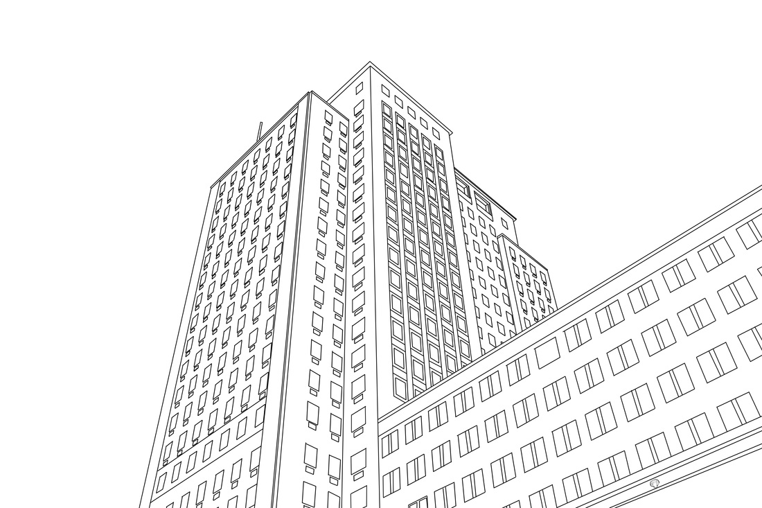
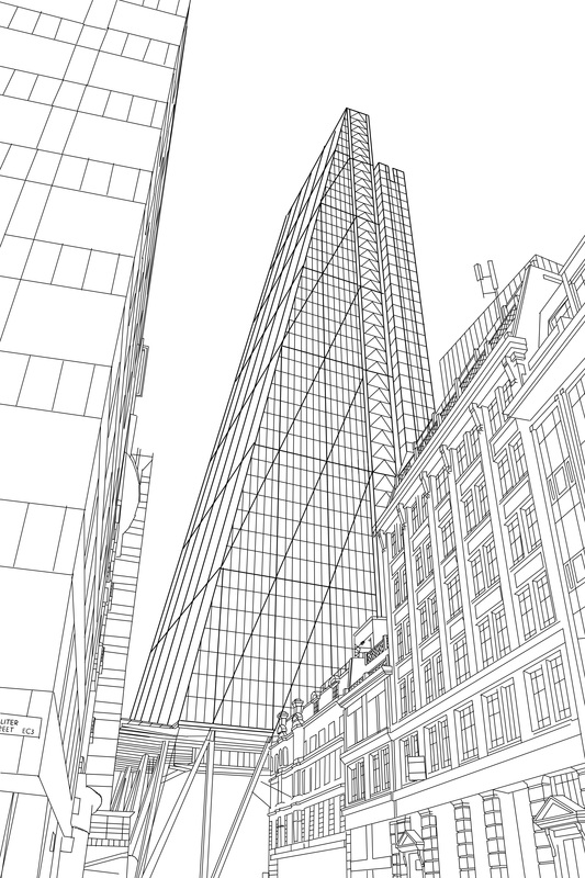
The video to the left shows the process of creating the vector drawing of the building. This takes a long time but I think the outcome is very good and looks good. I like how the lines give the viewer perspective.
|
Vector Buildings #2
|
|
This is a vector drawing of the picture on the right, this piece took a very long time to create (around 4 to 5 hours) I used a graphics tablet to draw on top of the image, I really like the outcome as there is a lot of detail in the image and it seems to look like a architecture's design for the building. I would like to carry on using this technique, I think that it could look good in a city skyline with only a few buildings being in vectors and others just as normal buildings. I really like the basic feel of the piece as it only have 2 colours and straight lines. I also think that it gives an interesting view of the perspective of the picture.
Gifs
This Gif has a unnoticeable loop, the image resets itself. I think this is good as it shows how the image has evolved and warped and then it brings it self back to the original state. I really enjoy making Gifs as it brings more to an image, I would like to use this technique with more of my photos, I may like to play around with some of the grid photos and move around the different blocks.
Puzzle Gif
I then decided to make a gif of the blocks changing position, I thought this was an interesting idea because it shows the evolution of the image and how it evolves to become a puzzle and the user has too look behind the puzzle to fit the puzzle together to view the actual image. I like how it engages the audience. I also like the colour and tones which have been formed from the expired film. I like them as they have a wide range of tones and the dark tones are very sharp and contrast with the very bold and colorful highlights.
This image was taken on top of the Citi Building I like it as the never changing image represents the ever evolving city landscape. I would like to create more of these gifs but with different shapes such as triangles or circles. I think this would be good as the different shapes would allow me to create a different type of Gif. I also like how only one part of the image is moving and muddled up.
This Gif shows the O2 building being manipulated and transforming, With this Gif I decided to show the audience what the image looked like before, this is why the Gif loops form a stable and correct image to a jumbled up image. I also like how the speed to different in the Gif and the change gets faster and faster. I would like to see the Gif have a smoother feel to it as it looks jerky and rushed.
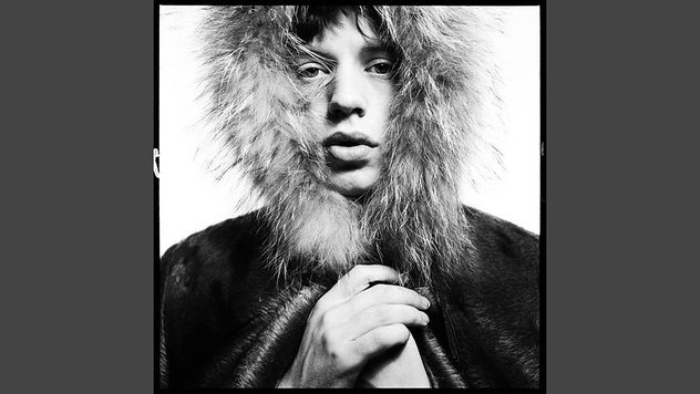
David Bailey Exhibition
|
I went to the national portrait gallery to visit David Bailey's stardust exhibition. I really liked some of his portraits and it was a very visually stunning exhibition. I was able to see a large range of his work, from the photos he was famous for and the newer stuff. My favorite photo form the exhibition is the photo of MC Jagger bellow. I really liked the lighting and the wide range of tones. I thought the face was lighted perfectly as you where able to see all the expression in the face. I also liked how the jacked has a large contrast with the white background. All together I thought it was a wonderful photo that really stood out to me.
|
|
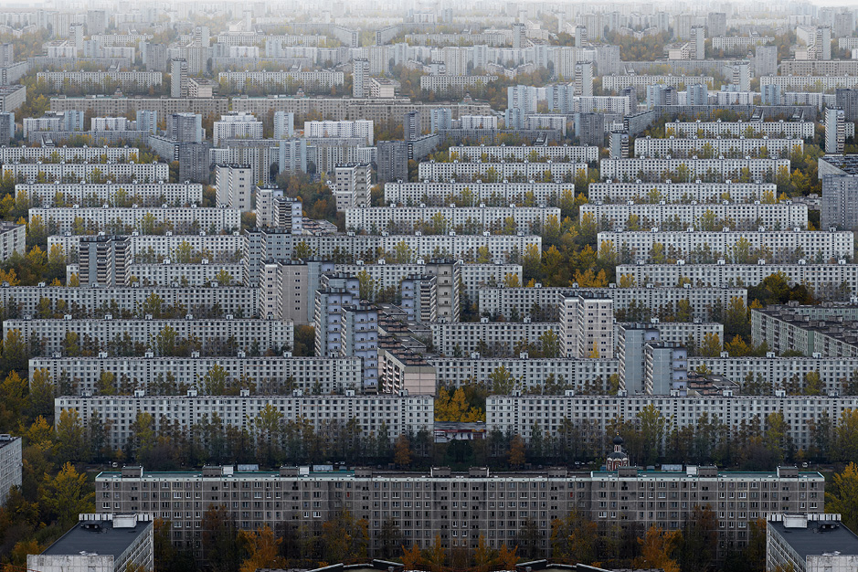
Marcus Lyon "Brics"
|
I then looked at photographers that use buildings in there work and found this photo was taken and edited my Marcus Lyon and it shows what he thinks the big city's of the earth will look like in the future with the problem of over population. He has duplicated buildings and made the landscape look busy and over crowded. I like how this photo was framed as the whole photo is filled with the building and it looks like it stretches on and on. I also like the colour as it is slightly desaturated showing how the city becomes so overpopulated that it becomes dull and boring. I also like how the photo shows few trees in the city and more buildings than trees and nature. This shows how we as humans are forcing out the nature and replacing the land with buildings that kill of the trees and plants.
|
|
|
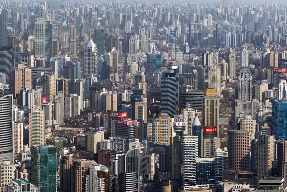
This is another photo from the set called Brics. This one shows a city in Shanghai it shows millions of sky scrappers covering the city landscape. I like this photo as it was take at an angle show you can see further into the distance. This allows him to cover more of the photo with buildings and skyscrapers to show how china is becoming the new world power. I like this idea of the growth of the city as I live in London which has a large population and new sky scrappers are popping up all the time. I would like to try and do something like these photos by Marcus Lyon. I would like to go up the London eye and as my dad works in the gherkin I would be able to travel to the top and take some photos of the London skyline. I would then come home and edit them and place new buildings from other photos and the same photo and create a new London landscape which is a depiction of what I think it will look like in the near future.
|
|
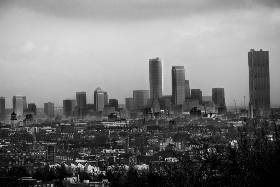
Growth Of The City LandScape
|
This is a response to Marcus Lyon's project called Brics. The original photo is to the left and I have increased the skyline and created more buildings from other photos that I have taken of different skylines. I took these photos quite far away from the actual city center, as they where taken at the highest point in London. So I think to develop this I would have to travel into the city and go up a building to get a closer view of the city. I plan to go on the London eye to get a 360 View of London. I will then Edit the photos together and create a panorama. I really like this process and the outcomes that it creates.
|
|
How this photo edit was created
For this photo I used two programs, I used Adobe Photoshop to edit the buildings by cutting them out of different photos and then placing them in the background image shown above (colour). After I had cut of some building I then imported them into the base image and started merging them into the background this was done by cutting out the background of the image and then reducing the opacity so I could see what was behind in the background. Then to get the illusion of having the building in the photo I had to rub out certain parts of the building to get it to fit into the image. I had to do this for every building. Then I imported it into Adobe Lightroom for editing the colour and appearance of the image. I used several tools to get the image to have the correct light for where the building is placed in the foreground or the background.
City Landscape second edit
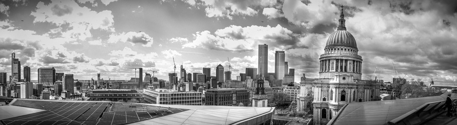
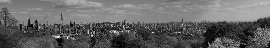
This photo was created by using several photos taken in a horizontal direction to create a panorama, I then used photoshop to automatically stitch the different photos together and then I used photoshop to cut of several skylines that I took photos of on other photo shoots. I then used these to create a new skyline with a lot more buildings. After doing this I imported the photo into adobe Lightroom and adjusted the tones of the black and white photo. I also used adjustment brushes to touch up only certain parts of the photo, this gave the photo a larger range of tones. I like this photo as it has the old and traditional buildings (St Paul's) and the new buildings in the skyline. After creating this panorama evolved London, I would like to create another but with a better view. I really enjoy creating these city landscapes and would like to carry on with this strand.
City Landscape third edit
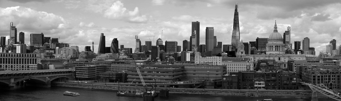
This is another city edit that i have made, the initial photo was taken on top of the Tate. I then used other photos of city landscapes to cut out skylines and implement them into the background image. This photo was edited on photoshop I like having a black and white photo as not only does it make the buildings match up, as in colour it is very hard to get the imported building to match up with the background and having the photo in black and white is a lot easier as you only need to play around with the levels and use a blend tool to blend the building into the background. I would like to create a piece of work similar to this and the second edit but with a panorama of the whole of London, this would only be available from the view on top of the shard. So I am going to book a ticket to the top of the shard to take photos all around the building and capture the whole of London. I want to try and adapt and evolve this idea, I may go back to creating Gif's and show how the city grows. I think this would be a very interesting idea as the audience can see the photo develop.
Evolving City
The Gif above shows a creation that I have made on adobe photoshop, I tried to create the London of the future, I used Photoshop to cut out some sky scrappers from pictures that I took on top of the CITI building. I then placed them into the scene and edited them to make them match up with the background. I really like this idea and would like to create more of these and maybe on a larger scale. I think the Gif above is very effective as the audience can see the building and skyline grow step by step. I like the movement in the Gif as it shows the contrast between the past and the future. I think it is a very effective way to show the evolution of the city and how we will have to deal with the population of the capital city's growing day by day. I also like how the Gif is in black and white as it creates really powerful and sharp tones. I would like to take more of these and create them, however it is a very long process and takes some time to do. When I next create one I will use a screen capture showing the process.
Ally Pally Edit
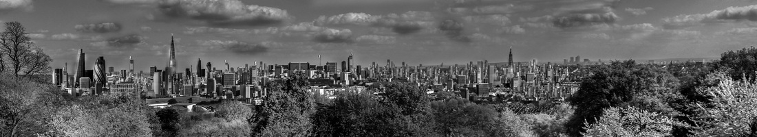
This panorama was taken in ally pally, I took several photographs and then stitched them together in photoshop, I then used the content aware tool to get rid of objects that didn't fit the photo such as lampposts in the bottom of the screen. I then copied several skylines into the image and created a "new London". Ally Pally was very good as I was able to get a large open view of the city and this allowed me to created a bigger Image that had a lot of buildings in it and was able to be blown up to a large scale so the audience can view the image. Therefor to get the full effect of the image, it should be printed out so the audience can view it in greater detail and get close to the image.
Ally Pally Edit 2
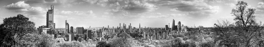
This is another edit that I made from a panorama from a different location in ally pally. I think they have come out very well, but to get the full effect of the image I think it would need to be printed out so you are able to see the buildings in more detail and closer. I work like to do more of these panorama's, I could also make these into Gifs and do the same as the Gif above which shows the city landscape growing. I think I would like to carry on this strand for my final piece as this is the strand that I have found most enjoyable and I think it lends me to create a really powerful final piece.
Ally Pally Edit 2 Process (video)
This video shows the process that I take when I edit one of the skyline city shots. It takes quite a long time to make one image as you have to build up the image very slowly and it takes time. However I think that the outcome is worth the effort that goes in to creating one of these. For my final piece I plan to take a 360 view of London from the highest point (the Shard) I will then edit the photo and place in lots of buildings like I have for the previous edits.
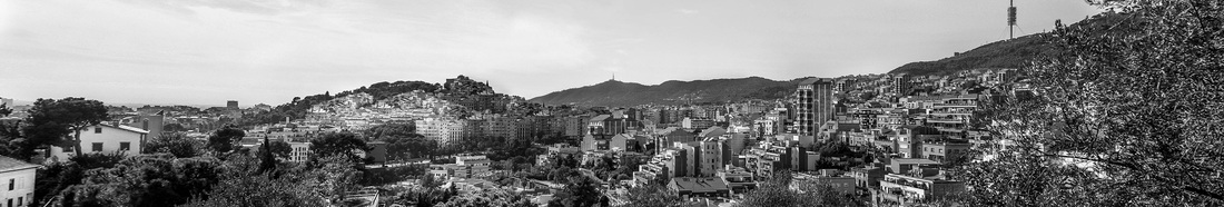
Barcelona Edit
This is a panorama edit that was taken in Barcelona on a school trip, I found several old photos of a trip that I took to Barcelona I then imported several into photoshop to create a panorama, In this photo it is fairly hard to see what I have done to the photo however I have added lots of buildings into it and made the picture very busy. I did like creating this piece however I prefer working with more of a skyline as it is more clear and your able to stop all the added buildings.
Marcus Lyon and Me

Marcus Lyon did a series of photos called "Brics" where he took photos of major city's from a helicopter and then in post production he added to the photo to make it seem more built up and over populated. His whole project was on the idea of how the future city's are going to deal with the ever growing human population. I think the photos that he created where very good as it was very well edited and it shocked me how many buildings there where in the scene. This then made me think about over population and how we are going to deal with this large problem. I think his work is very good as it get you to think about the future of our planet.
|
My work is similar in ways as I am building up city skylines to show what I think the future city of London could look like. However my project is not based on population size however you could interpret the work in the same way as Marcus Lyon's. My work is different in the way that I used a large city panorama while he concentrates on one point in the city. He also uses different angles as he has taken the pictures from a helicopter, so he is able to look down onto the buildings while I'm limited to taking pictures from an angle. However I feel that Marcus Lyon has given me lots of ideas and I have found his work very useful and inspiring for my own work.
|
Drawing Over The Skyline
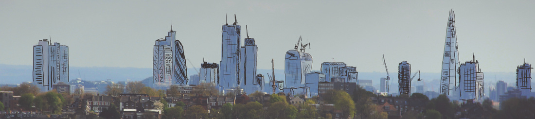
I then decided to do more drawing over the skyline, as I only did a little bit in the piece before. I liked the idea of portraying how a design of a building then becomes a physical building it shows the growth and evolution of design and style of buildings. I would like to carry on this section as I think of lots of idea's to do with this. I would like to take pictures of the skyline at night so I'm able to get all the colorful lights from the buildings in the photo, and then I would like to draw in some buildings that could be a imagination or design of the future London. I liked the idea of drawing on top of the skyline, however I would prefer to use vectors as this would give a cleaner look to the image. I thought it would be a pretty good idea to add vector buildings into the skyline as it could show what architectures are drawing for future buildings and so what they are imagining what the city will look like in the future. So therefore I would like to combine the work that I made in response to Marcus Lyon and the drawing over the skyline work.
My ideas so far
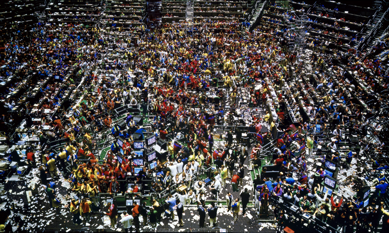
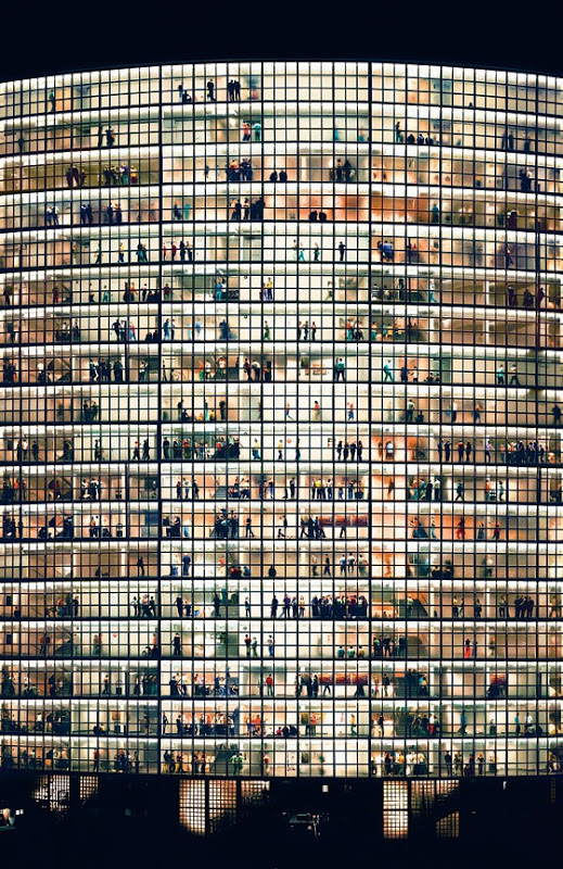
Andreas Gursky
|
Andreas Gursky pictures show over population and have lots going on within the image. I really like the bright colours and the vibrancy of the image, as it brings out each person within the image and allows the viewer to see the vast amount of people within the image. I really like his images as they show how far the human race has come for a few small tribes living in caves to massively overpopulated buildings and places.
|
|
|
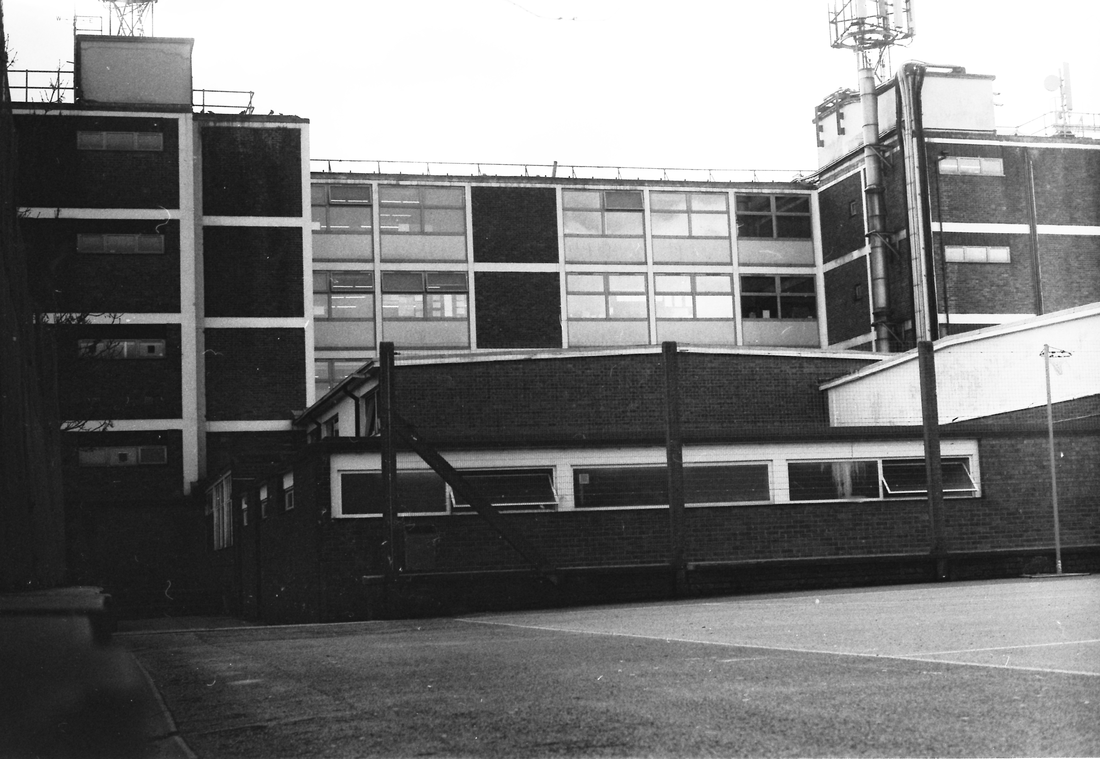
This is another image by Andreas Gursky, It shows an office building with lots of floors and people within the building. I really like the lighting within this image as it brings out the small people within the frame. I like how the photo has a lot going on within the frame and shows the complex environment of skyscrapers. I think that his images show how over population is a real problem and that the capitals of the world are going to have to expand to deal with the exponential growth of the human population.
|
|
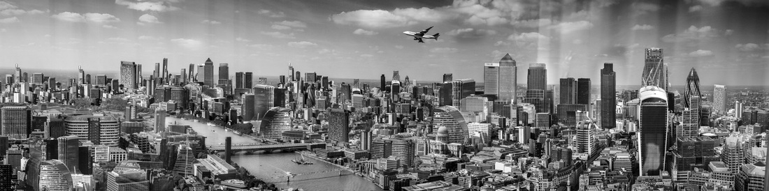
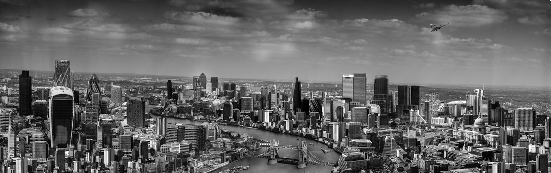
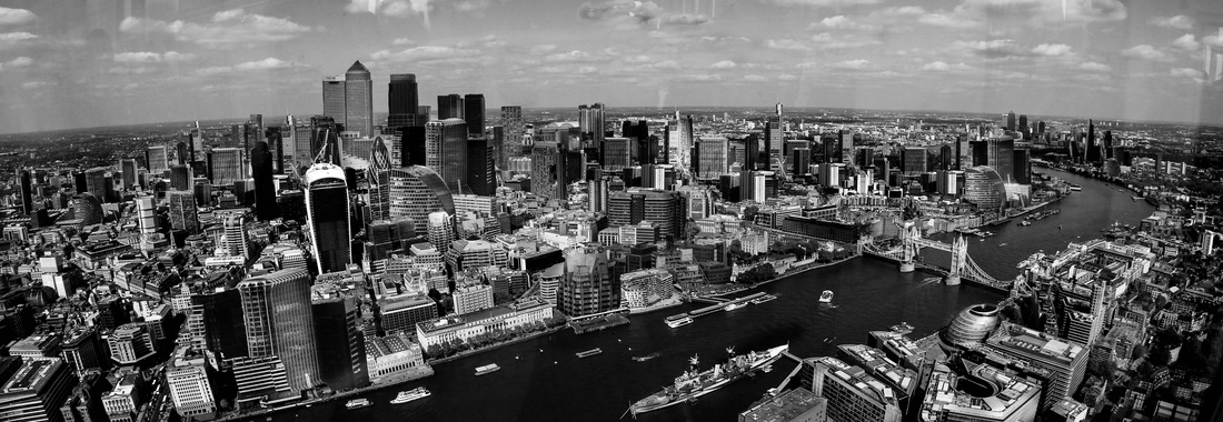
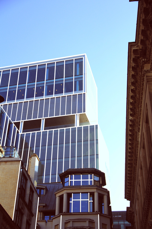
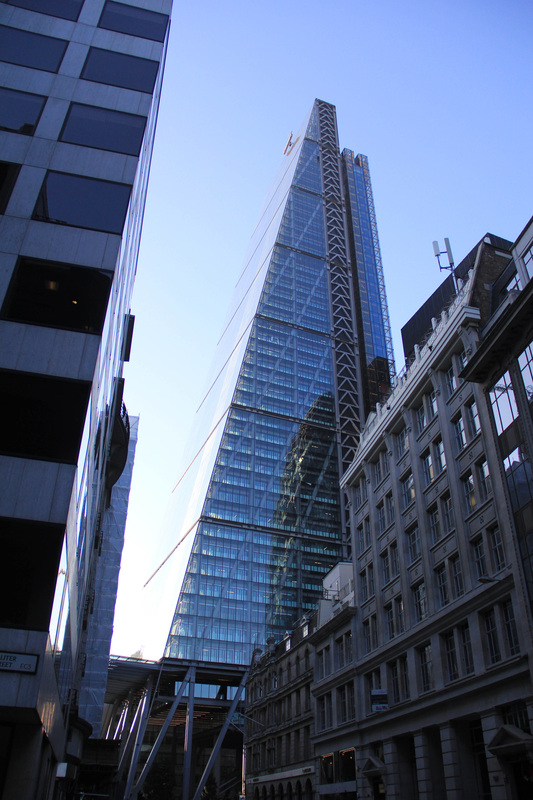
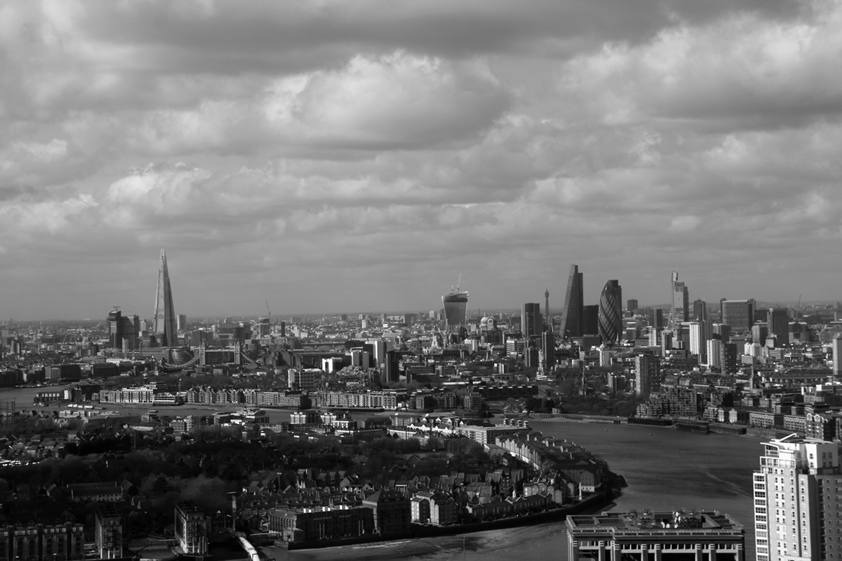
The view from the Shard
I then went to the top of the shard to take some photos for the view of London, this then allowed me to create some future city landscapes of London. I thought it would be a good idea to take the photos for my final piece from the top of the shard as you are in the centre of London and it is very high up so it would be a good place to create a panorama of London. I am going to edit the photos in photoshop like I have done before in the previous edits above. I will also do final adjustments in adobe Lightroom to get all the buildings to be the same exposure. I will also use lightroom to create the black and white look that I want. I liked to edit the photo in black and white as I think it creates contrast between the "old" look of the photo and the new futuristic London SkyLine. Below is the contact sheet that shows all the images that I took when I went to visit the Shard. When taking these photos I also used a ND filter as I didn't want the sky to be over exposed. This allowed me to take a picture that had a correct exposure for the foreground and the background. This is important as I am making the photo black and white and it will allow me to have lots of texture in the photo and it will make the photo stand out more.
Final Piece